
In a recent Wall Street Journal editorial by Richard McNider and John Christy, the authors make the claim that not only was John Kerry “flat wrong” on Climate Change in his Feb. 16 speech in Indonesia, but that the climate models used to predict climate sensitivity have “been … consistently and spectacularly wrong”.
I won’t expound here on the actual claims that McNider and Christy make in their piece — plenty of others have already weighed in on the issue (including the Guardian, ThinkProgress, and ClimateScienceWatch). What I am interested in discussing here is the sole figure used to make their point — specifically the omissions and obfuscations it employed to make their point seem irrefutable.
So, let’s go through a “what’s wrong with this picture” exercise, and see if we can learn something about statistics and why you should always question what you see. Below, the figure in question:

1. Confidence limits
The first issue is the lack of confidence intervals (sometimes called “error bars” or “uncertainty ranges”) in the plots. This is especially concerning since all three lines result from averaging a HUGE amount of data (or model output). Without identifying what these are, and they are likely large, we have no way of knowing if these curves are actually different.
2. Shifting baseline
A second clue that perhaps the data (and model results) are not being presented in the most appropriate way is apparent from the footnote indicated by the asterisk:
The linear trend of all three curves intersects at zero in 1979, with the values shown as departures from that trend line
What this means is that the graph isn’t actually showing “Global mid-tropospheric temperature” — what it’s showing is the deviation of global mid-tropospheric temperature from a linear trend fit to each data set. This is often referred to as a “shifting baseline”. In other words, the plot doesn’t really say anything about the differences between the models and the data, but only about how each of them differs from their own linear trend. To be clear, we are not being shown the real data/model output. In fact, since we are not given the information on the linear trends we cannot even rule out that the data have a larger total trend than the models (i.e. the opposite of McNider and Christy’s point).
3. Improper fit?
There’s another problem with the graph. If the displayed values are departures from a best fit line to the actual temperature data (presumably from 1979 to 2012), how is it possible that the deviation (or residual) from the best fit line also displays a linear trend? In fact, in the case of the model line, the residual never goes below zero. Put simply, if you fit a straight line to a series of points, there will always be points that lie both above and below the best fit line. This appears to not be the case for McNider and Christy’s fit, particularly for the model line.
So what’s going on here? Essentially the data that went into the plot have been manipulated in a way to give an impression that may not have been supported by the original data. I will give you an example. Below I have plotted two exponentials that behave similarly over the 40 year time span. One has a less-steep slope in the first 20 years (the black line), the other a steeper slope (the red line). I have also added some noise (the grey and pink regions, which reflect some uncertainty, see Point 1).
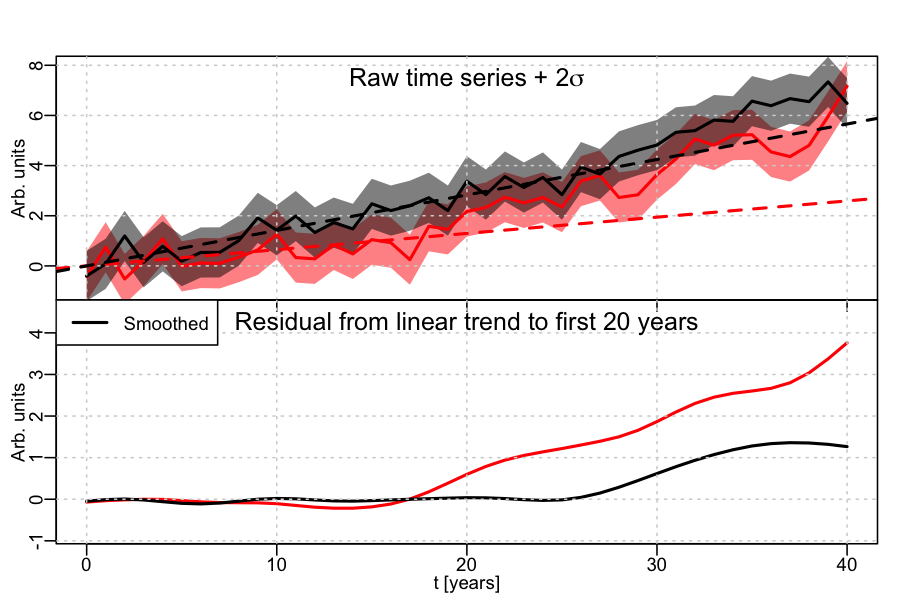
Now imagine that I fit a linear trend to only the first 20 years on both curves. In the case of the black curve, slowly varying, the linear fit looks like it captures much of the slow variation (including points above and below the line). If this were air-temperature, the linear fit is a pretty good approximation to the data. If I do this with the red line, though, a linear fit over the first 20 years does not work as well. Now instead of showing you this plot – which would convey that the red and the black curve look alike and that linear fits derived from the first 20 years work well for one but not for the other – I show you the smoothed residual – i.e. the difference between the original data and the linear fit as a function of time. For the black the residual is small. For the red it is big.
This is similar to the plot shown by McNider and Christy. They argue that because the red residual (the model) is larger than the black residual (the data) this means that the models are warmer than the data. But this conclusion is not supported by their figure (as I just showed you). In fact, in the example I presented the red curve (the models) are always colder than the black curve (the data).
In conclusion, the plot shown by McNider and Christy does not show what they say it shows. Instead, it appears to pull out a number of tricks to promote a message. If it had been submitted to a peer-reviewed journal it would never have made it through. That’s not to say that everything meant for the public has to be peer-reviewed, or that a publication’s OP-ED desk has to have the scientific background to spot a problem. But it does highlight that there should exist a basic honesty in scientific discourse — whether between scientists or when engaging with the public. Interfering with that honesty erodes everybody’s trust in the scientific process.